New Gap Logo Controversy
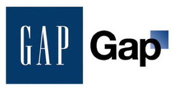
SilviaV, October 9th, 2010Last monday Gap unveiled its new logo on gap.com and Facebook. The classic blue box has been scaled and the serifed Spire font has been replaced with the ubiquitous Helvetica.
The reactions online have been almost unanimously negative; from the (fake) twitter page, to the satirical “make your logo in a Gap style” website, it seems that everybody hate the redesign traditional emblem.
Marka Hansen, president of Gap North America, explained on the Huffington Post that the new logo is part of the restyling the Brand is going through and assured that, considering the strong reactions, this won’t be the definitive version of it:
Now, given the passionate outpouring from customers that followed, we’ve decided to engage in the dialogue, take their feedback on board and work together as we move ahead and evolve to the next phase of Gap.
[…]We’ve posted a message on the Gap Facebook Page that says we plan to ask people to share their designs with us as well. We welcome the participation we’ve seen so far.
Read more on Brand New “Don’t Mind the Gap, or the Square” and “Follow-up: Gapgate“
October 12th, 2010 at 9:48 am
bemerkenswert. Danke für den interessanten Beitrag, der zeigt, wie schwer’s Markenunternehmen in Zeiten der vernetzten Echtzeitkommunikation haben und wie stark die Stimme der Verbraucher zählt. GAP gibt ihnen das alte Logo zurück: http://adage.com/article?article_id=146417
Wenn sich die lieben Verbraucher nur wegen allem was so schief läuft zu Worte melden würden, …
October 12th, 2010 at 9:55 am
die Stimme des Volkes in Echtzeit 😉
http://twitter.com/gaplogo
January 7th, 2015 at 9:42 pm
wedding dj perth…
blog topic…